Sunday, July 31, 2011

Don't Take it Personally

You have an amazing collection of framed memories, you've hammered a million holes in your sheet rock to hang them, and now you have to sell your house. Eeeeeeeek! Hopefully you will read this blog before you get to this pivital moment! Here are some tips to help you depersonalize your family shrine:


If you have created a wall collage of family photos, here are some easy fixes to keep your frames displayed without having your personal photos distract potential buyers while they tour your home-
1. Replace photos with more generic photos purchased from an online source. Here are some shops on Etsy that have 4x6 photos for between 3.00 and 5.00 each. If you purchase more than one image from a shop, they will combine your shipping charges. Yay!
Shop at "The Gallivanting Girl" on Etsy
Shop "Ashes Imagery" also on Etsy
Explore other sources on Etsy by searching under Art: Photography: and then whatever subject matter you like. (Hint- at the top of the search results page, you can opt to search from Prices Low to High)


2. Hunt on Ebay for prints. You can find AMAZING vintage prints this way, and super cheap. Some trendy prints include botanical prints and specimen prints. Prints like this can also be cut from calendars and art books off the clearance shelf at your local book store. Buy calendars after the New Year to score twelve coordinating prints in one swipe.
littlegreennotebook.blogspot.com
bibliodyssey.blogspot.com


3. Use scraps of graphic print fabrics as the art. Cool scraps of vintage wallpaper are nice as well. Look for colors and patterns that compliment the rest of your interior. If it can fit in the frame, it can be art!
Heck, this would be cute any time! Not just for replacing family pics! designindulgences.com
bhg.com


4. This is my personal favorite. If you have enough forethought, while you are capturing your family moments on camera, take a few moments to snap some pics of your surroundings as well. If you are at the beach, get some shots of the sunset, palm trees, a pretty shell in the sand, etc. You can find beauty in just about anything. Something as simple as an old fence row, a really interesting architectural feature on a local public building can all look amazing when framed in black and white! The nice thing about using these as alternative photos is that they will still have a very personal feel for you. AND this option is super cheap! When you print your family photograph to go in a frame, go on and select an alternative image to fit the frame at the same time. Mount the backup photo behind your personal one, and then when it's time to pull the ol' switcharoo, it will be a quick fix.
Replace pictures of the kids from your fishing trip with a picture of the boat dock. Still special, just depersonalized! 30.media.tumblr.com
Look for beauty in everyday objects. You won't have to go far to find stunning shots!   convoy.tumblr.com


If you have not yet created a memory wall, and hammered a million tacks into the sheet rock, consider mounting a few shelves on the wall to prop all of your frames on instead. Fewer holes in the wall may be more appealing to potential buyers.
www.google.ca
Instead of replacing images in your frames, you can just remove the frames and display other objects on the shelves while your house is on the market. Pottery Barn
Another way to minimize the amount of effort in preparing your home for sale is to keep your family photos limited to tabletop frames. Your realtor will advise you to depersonalize and declutter your tabletops, so this will kill two birds with one stone.
Pottery Barn
Let's face it; personalizing with family photos and momentos is essential to turning a "house" into a "home". When the time comes, there are simple solutions to depersonalize your space, but until then, embrace and enjoy every square inch of your home!

Saturday, July 30, 2011

Attack of the Family Photos

Since the birth if our daughter last July, our house has morphed into a Lola Jean showcase. She's everywhere! And she loves it- grinning and flirting with the pictures of herself in every room, as if to say, "You're so pretty...No, you're so pretty." D-I-V-A. We are so proud. Before Lola, we had a few tabletop pictures of Maddi and one or two wedding pictures on the wall. My, how things have changed!

Now we all know (I hope) that DEpersonalization is key when staging our home for sale, so I am well aware that I am digging myself into a deep hole every time I add another photo of our sweet Lola to the wall. But who can resist?!? Hopefully we can have our cake and eat it too with a little forethought and planning.

One largely popular trend right now in art displays is clustering frames together for a large scale impact. I love, love, love it! You can use this approach with photographs or any other framed art, or a combination of both! Here are some examples:
If you crave symmetry, stick with one style of frame like this pic from www.thebooandtheboy.com. Having all of your images printed in black and white will also create a sense of uniformity.
Square frames are a nice variation, and are perfect for people who prefer perfectly symmetrical displays. www.google.ca

If you like a more eclectic feel, mixing different frames and even different kinds of art is A-okay! This display has photographs and other prints mixed together. www.everythingfab.com
Anything goes! If you have an interesting collection of frames, let them stand alone as a piece of art! Painting them all one color makes the display feel like one large piece instead of individual pieces. This is a great way to get your "pop" of color in a room. Look for cool frames at yardsales. Even if they have a goofy print in them, they are usually cheap and you can replace/remove whatever art that was originally there. www.marthastewart.com 
Note how all of the different frames are united by the linen colored mats and black and white images. mysweetsavannah.blogspot.com
This fun, lighthearted room is a rebel! All of the bright colors in this display work because they are not competing with other patterns and colors in the room. Notice how neutral all of the other furnishings are. http://www.apartmenttherapy.com 

If you have the budget, and you do not trust yourself to piece together a collage from scratch, consider some of these options:
Reference a picture from Pottery Barn, go to their website at www.potterybarn.com, and purchase all of the frames at one time. Perk: most of their frames have free shipping! Fool Proof!
The Picturewall Company sells frames in a kit, complete with hanging instructions and template! 
Here are some links to templates that will help you lay out your new wall collage:
There are great "Frame Cheat Sheets" at lilluna.com

Pottery Barn has great templates and even a video to help you create your very own memory wall.

 Ok, Great. Now we have a fabulous, personal, memorable display that eats up our entire entryway, and we have to sell our house. Thanks a lot, Laura. Don't blame me; you're the one who thinks everybody wants to see your children at 3,6,9,12 months on every wall in your house. =) Family photos have come a long way since the days of wicker chairs and hokey backdrops. Praise the Lord! For tips on how to tone down your 3 dimensional brag book aka your house, join me tomorrow and we will explore quick fixes for depersonalization.


Thursday, July 28, 2011

Naked Walls, Oh My!


Moving on to a slightly different topic today, let's talk about dressing up our walls with art! There are so many different things types of wall art out there- oil paintings, shadow boxes, framed prints, canvas prints, family photographs, and one of my favorites... children's art! Deciding what style of art fits your home is the first step to creating a cohesive space. As with wall colors, using wall art that is similar in style will help create a sense if flow throughout your home. This does not mean that you cannot mix different types of art. Basically, if you took all of your hanging art off of the walls and put it in one big pile together, you should see some similarities. Ex: If you have landscape oil paintings, botanical prints, and more natural toned art in your living room, you may not want a bold, modern, abstract piece in your adjoining dining room. I love a home that feels like it has been constructed over time. I think having a mix of old pieces and new helps to achieve this feeling, not only with wall art but furniture as well. If you would like to incorporate some piece that have an antique or vintage charm, visit some of your local antique stores, flea markets, and yes, even yard sales. Not everything at antique stores is creepy and expensive! Here are a few of my favorite local places to hunt for treasures:

Gas Lamp Antiques and Decorating Mall in Nashville, TN. Do not let the expensive pieces showcased on their website scare you away! They have a huge selection of decor in all price ranges. This store recently became one of my all time favorite antique shops, and it is massive. Plan on spending several hours here if you make a trip.  

Nashville Flea Market at the Tennessee State Fairgrounds. Ok, I admit, you may have to wade through vendors selling socks, purses, and old makeup in bulk quantities, BUT there are a few vendors that make the trip worth your while also. I go here to get oil paintings SUPER cheap. You can pick your oil painting and a frame and have it mounted and ready to hang in a matter of minutes. The reason why these paintings are cheaper is because, while they are all handmade, they are also produced in large quantities. Don't kid yourself into thinking every pricey oil painting in a gallery is a "one of a kind." I recently saw the exact same sheep oil paintings that I have in my daughter's room (I paid $55.00 a piece for them including the frames!) at an antique store. They were asking $280.00 for each painting!

Frame your own art, family photos, or prints with open-back ready made frames from Hobby Lobby. Their frames are on sell 50% off every other week. This route is definitely cheaper than having custom frames made, and they have a great selection of styles too. For the best selection, try to go on Mondays. They get picked over quick!

And I have to admit, one of my indulgent favorites is always Pottery Barn  for frames. They have a great selection of eclectic frames that still have a cohesive feel.
Note how many different frames are used here, yet they all have a similar feel. The black and white images help pull them all together.

I know today's post is pretty basic, but sometimes knowing where to start is half the battle! Decide what style fits your home and personality. Perhaps you are very traditional, or maybe you have a modern feel in your home. I personally like things that have a time worn, cottage feel, and you may feel that my blog is somewhat biased towards this style. If you think your style leans more towards the modern, contemporary spectrum, check out these blogs for inspiration Marie Burgos Design, MoCo Loco, Loft Style
Sticking with one style will keep the rooms in your house from feeling disconnected. Tomorrow I will give some tips on how to display family photographs!


Tuesday, July 26, 2011

My Drool of the Week

Ok, so still on the topic of walls, I have to confess one of my biggest obsessions: horizontal wood paneling. This ain't your grandma's 70's paneling for sure, so don't let the stigma scare you! A friend and I were talking about using shades of white on walls a while back. She loved it. I wasn't sold on the idea. White walls just reminded me of a blank canvas waiting for something more exciting to happen. Then she challenged me to look through all of my favorite decorating magazines and take note on how many of the spaces had white walls (or shades of white). Holy cow...she was right! But these walls didn't look like blank canvases at all! What made them different? TEXTURE!!! The spaces that had super light walls still had loads of visual interest because they were not covered with your typical, smooth dry wall. Wainscoting and wide plank wood paneling look amazing when painted white! Here are some inspirational rooms that I daydream of for my own home someday:
Talk about a stairway to heaven! 
Come on in? Well, if you insist!

These walls aren't stark white, but have a subtle blue tint. 
Perfect for any room in the house.
Now I know I preach about resale value, so note that the title of this post is called "My Drool of the Week." I am well aware that making upgrades of this caliber may not be appropriate for every home, mine included! Sigh.....someday....My personal justification for it is its durability. Hopefully we will have a house full of heathen children and wood paneled walls in the near future! If you need justifications of your own, here are some more: easy to install, adds depth and character to bland spaces, can easily be repainted, can add value to your home. Just be mindful of surrounding property values before you tackle large scale renovations in your own home. You don't want to go overboard and be in the hole when you resale! I guess for now, I will just have to add wood paneling to my ever-growing wish list of wants for my dream home. If you want to have your own drool today, check out www.pinterest.com to search for inspiring photos and "pin" them to your own idea board. All of today's images were collected there!

Monday, July 25, 2011

Skidamarinky Linky Link

Here are some links to find more painting inspiration:

House Beautiful's Paint Color Trends
White walls are crisp and airy. They work best when your walls and ceiling have lots of textural interest. Notice the stone fireplace and exposed beams on the ceiling. Yummy!!!!
 Check out this AMAZING blog by Pretty Handy Girl for a tutorial on how to transform outdated textured/popcorn ceilings and brighten your space.
Wow......what a difference! The textured ceiling absorbs more of the natural light, while the smooth ceiling brightens the room significantly. If you are fortunate enough to custom build a home, please consider paying the extra upfront to have smooth ceilings- so much fresher, versatile, and up to date.
If you are environmentally conscious (you are the BEST!) and if you love fresh, clean air for your family, consider these Low VOC paints by PPG Porter Paints

If you are torn about what kind of paint finish to use in different rooms, check out this helpful site also provided by Porter Paints.
I <3 the Pure Performance line.  NO VOCS!!! And extremely durable. Perfect for a family with little ones. Your children will have clean air to breathe, and you will have fingerprint free walls to boot!
All this talk about paint this week has made me want to bust out the rollers and make some magic happen! Changing the paint colors in your home can completely give you a different look. If you are house hunting, please do not let someone's poor taste in paint colors prevent you from seeing the true potential that a home my have. If a house has good bones, a professional painter can take care of that ugly duckling in no time! There are so many great professionals out there that are hurting for business right now. I promise you, by the time you pay for the paint, rollers, tape, brushes, drop cloths, the list goes on and on and on...you could have paid a pro to come in and tackle the job in just a few days. A good quality job makes all the difference in the world. If you frequent my blog, I'm sure it won't take you long to discover I have a recurring theme: Do it once, do it right, and you won't regret it!

Sunday, July 24, 2011

A Flair For The Dramatic...

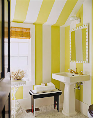
Ok, so I know there are exceptions to every rule, and after bursting everyone's color bubble yesterday I feel like the wild and crazy, taboo colors in the fan deck need some representation too. So here we go! If you just absolutely can't resist the temptation to use a bold color or maybe you are even a fan of <gasp!> wallllllllllpaper, try to incorporate them in smaller rooms that you spend limited amounts of time in. Bathrooms, laundry rooms, hobby rooms, etc. Let them be your little gem boxes. These are rooms that aren't openly visible from your main living areas. When these bolder walls are tucked away in rooms that you visit for short amounts of time, you are less likely to lose your enthusiasm for them. And it can be a fun, refreshing surprise that makes you smile every time you use the space. A nice bonus is if/when you do grow weary of the color, a smaller room is much easier to make over. Bold colors are like the jazz hands of the decorating world. When used in small doses, they deserve a standing ovation. If they are overdone, the whole space can feel...well...obnoxious. Here are some fun little gem boxes I like:

Isn't this adorable? This laundry room was featured in Country Home magazine

I would love to do my chores in this funky laundry room!


hgtv.com has lots of ideas for using graphic print wallpapers. They work great in this powder room.
Designed for a Hampton's cottage by Leslie Klotz, this beauty was featured in House Beautiful magazine
You can add graphic interest just by using paint!

In a nut shell: Bold color, wallpapers, and vinyl wall appliques all have a place to shine in your home. Use moderately for highest impact in small, tucked away spaces. Try to pick colors that still jive with the rest of your house (maybe just a more intensified version of colors you have used elsewhere) Keep the permanent fixtures in rooms like bathrooms simple and classic in their design and then add impact with color or pattern on the walls. This is a much easier fix if you need to tone things down later on. Remember, use your jazz hands sparingly!

Here are some links to fun flair for your walls:

Circle Line Studio has amazing vinyl wall decals. You can find them and many other fabulous shops on etsy.com

Source4Interiors is a great source for wallpaper brands


Saturday, July 23, 2011

Control Your Color Cravings

Have you ever walked into a room with walls so loud that you can't even process what the rest of the room looks like? Color can either make or break a space. This has been a hard lesson for me to learn, because I love me some color! But over the years as I have painted and repainted, moved, painted and repainted some more, I have gradually discovered that the more muted the colors on my walls are, the more I actually love the space! You can infuse a room with color delicately and still have an amazing impact (THOSE PREPARING TO SELL YOUR HOME- TAKE NOTE!) I think I had an epiphany when picking a color for my daughter's nursery. I wanted pink, but every pink room I had ever experienced left me with a bad taste in my mouth (like pepto to be exact). I finally settled on a super pale shade that I adore called Plaster Pink from the Porter Paint fan deck. I knew my mission had been accomplished when it took people several minutes or even several visits to the room to even notice the walls were pink! Ahhhh, success. When your walls are toned down, it allows the eye to notice other things in the room.  Save vibrant pops of color for items that can easily be changed out: throw pillows, blankets, etc. If you decide you hate the direction your design is headed, feel stagnant, or like to seasonally change out your accessories, keeping your wall colors simple and subtle is key. More muted colors allow for longevity for those of you who have found your forever home, and are also neutral enough to appeal to the masses if you are wanting to move.
                                                                       
Two beautiful green bedrooms, no doubt.  But which one do you think has longest shelf life?

Short non-rambling version: when choosing wall colors, stick to the Neutral section of your fan deck.  Save more intense colors for accessories or painted furniture pieces. Purchase several sample quarts in different shades to test before committing. You may spend an extra $20.00 up front (a sample can at our local paint store costs $5.00) but it will save a ton of heartache later on. Always use high quality paint. Again, a little pricier upfront, but  so much easier to keep clean. Also stick with similar color intensities from room to room to give your entire house a sense of continuity and flow. If your living room is on the 2nd tier of colors on a fan deck, the adjoining rooms should come from the same tier. This is especially helpful when you have a extremely open floorplan where lots of rooms are visible from one perspective point.  Ok, now I am rambling.  More color tips to follow!

Hooray for Houses!!!

Hello, Home Enthusiasts! My name is Laura Williams and I love houses.  Almost sounds like I am introducing myself at a support group meeting, doesn't it? In a way, that is how I view this blog. I admit, I do have an addiction to houses. I am fascinated with them. Big ones, small ones, old ones, new ones. They are all unique representations of the people who dwell there- like beautiful fingerprints! 

Isn't it amazing how much you can learn about a person just by walking through their front door? Homes are like 3 dimensional works of art- every photograph, chair, and knickknack tell a story and evoke a feeling. Floor plans may be the same, but no two homes are ever alike! There is always a project underway at the Williams' house. I love how our home is always evolving to reflect the ever changing lives that we have. 

Sigh...sounds so dreamy, doesn't it??? I think it's every homeowner's goal to make their home feel personal, comfortable, and uniquely their own. Then why is it that we "oooo" and "ahhhh" over model homes, often holding our own homes up to such rigorous standards of organization, airiness, and super trendy design? The ugly truth is we need more for everyday living. So cruel! More personalization, more clutter, more furniture, more familiarity. A well-seasoned, lived in home is like a fine oil painting. It is a labor of love, it is cherished, it is full of life. A model home is more like an unfinished paint by numbers canvas. The framework for something amazing is there. It's structured enough so that we can visualize ourselves living there, but it is generic enough to allow a vast majority of people to also visualize themselves there. (And I guarantee you that no two people have identical visions for their ideal home) 

So now we find ourselves in a pickle- how do we maximize the space we currently have, making it special and tailored to our taste, when we have this nagging little voice in the back of our heads always whispering, "think about the resale value..." There has to be a balance! If I find the mystical solution to this conundrum I will surely let you know. In the mean time, I hope to share with you my own personal struggles and triumphs as I search for balance within my own home.